|
"Covenant"
Technical Review
Written
by Kimberly/Tigress35
I chose
a few scenes from this episode to really analyze in terms of
how the technical side can enhance the story. I do this primarily
through the cinematography, but also through
the editing as well.
Something
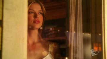
to watch out for this whole episode: pay attention to the way
Kara is lit. Even when she is in the same shot as someone else,
she is always lit much softer, and there is an ethereal like
glow around her. It's fairly subtle, but if you really look,
you will see it. It's very much Lord of the Rings, quite likely
digitially graded they way they did the elves, and I think they
definitely wanted Kara to look "out of this world"
and perhaps more beautiful. Something that makes her look a
little strange, yet still appealing. I don't want to say alien,
because aliens aren't usually lit like that, but she's lit different
and more magically.
Next scene.
The camera pushes in on both Clark and Lex as the editor cuts
between them. Push-ins typically signal drama and increasing
intensity, and that's what we have as Clark has to tell Lex
what he's been keeping from him, and Lex's reaction to this
information. It ends in really tight close-ups, and you can
see Lex's mouth twitch slightly as he asks Clark how it's possible
he saw Lionel in Belle Reve.
Rosenbaum
is really great in this scene, because you can see (and so well
because of the
tight close-up) the control he's trying to keep. Once Lex gets
definite confirmation, he does lose it a little. Lex walks away,
and he's back in a more medium close-up, which allows not only
the camera to begin to push in a little back on Lex, but also
increases the visual distance between Clark and Lex as they're
in opposition. Not only has Lex stepped back from Clark, but
he's stepped back from the audience as well. Clark is never
out of his close-up.
Clark steps
forward and closes the physical distance, but Lex is still in
that medium close-up. Interestingly enough, whether it's truly
sincere or not, as Lex appears to forgive Clark, telling him
that he is a true friend, he steps back into that really tight-close-up.
I think that means more that he actually moved back into that
framing versus the editor cutting to it.
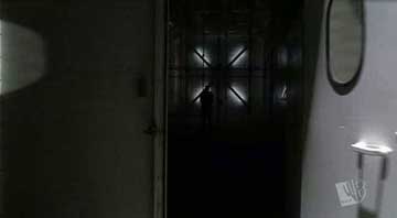
We hear
the sound of the door buzzing before we cut what I figure is
the jail where Lionel is. Overlapping sound is a typical way
to make a smoother transition. The door is opened to reveal
someone in shadow. There's a nice X in the background that is
lit by lights, and it appears to be the only source of light
in the room. Lionel is led into the room and tons of lights
are flipped on so the room is incredibly bright.
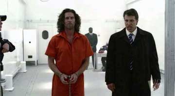
I'd like
to take a moment to talk about the jail itself. For one, it's
a fantastic piece of set design. I'll discuss that more later.
Right now, I'm going to focus on the lighting and color scheme
of the jail. It's very high-key lighting. Very bright, which
is quite the opposite of what you normally see of jails in shows
like Oz or something. Even the bars in the jail are a very light
grey and shiny, providing very little contrast or distraction
in the background. The brightness and the overwhelming white
emphasizes the sterility of the room. There's also rather few
shadows, not necessarily on the people, but in the area in general.
There's really no where for Lionel to hide, no shadows to duck
under so to speak. Especially notice how the light is extremely
bright on Lionel, but not so much the other agents.
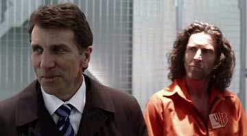
The other
thing that makes the white jail so nice is that the FBI agent's
dark suits and Lionel's orange jumpsuit stand out in excellent
contrast. I think it really makes us pay attention to what Lionel
is wearing, and to a smaller extent, his hair, because there
is nothing for his hair to blend into anymore, and I think this
makes it even more shocking when Lionel finally does lose his
hair.
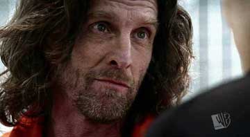
Finally,
especially compare Kara to Lionel. Lionel's image is extremely
sharp. Even in shots where the lighting is not so high-key,
it appears that there was no lens filter or any filters to bring
the softness down on the light, so you can easily see the pores
on his skin. It's definitely not a beautifying way to shoot
people. (No offense JG!) Even most of the boys on Smallville
aren't shot so they look so very sharp and in focus.
Speaking
of Kara, we cut back to her and Clark talking in the farmyard.
There's nothing significant about this that I can think of,
but even the truck in the background is lit blue. Highly likely
it means they had to place a blue light over the truck. Even
things that don't normally seem like they should be lit are,
and that's one of the things about TV that you don't usually
notice, but when you get on set there are lights everywhere,
lighting really specific things and walls. It gets pretty crazy
and why it takes so long to set up shots sometimes.
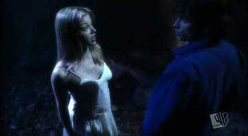
Anyhow,
Kara is wearing a white dress that only helps her soft lighting
and glow. As they float, Kara looks especially soft and glowy.
Zoom into the moon, and then they're in the caves, Kara looking
even more like she is actually a lost elf from Lord of the Rings
versus Krypton. A beam of light falls on Kara's hand that is
on Clark's shoulder, and it draws our visual attention to it,
especially when Clark shrugs away her touch.
Next up,
we have a close up of Lionel in jail, with enough space left
on the right side of
the frame for Lex to walk in. There's a slow rack focus, and
Lex's image goes from blurry to sharp in the frame. Whereas
before nobody was behind the bars in the background, the bars
blended into the white/grey walls. Now, however, Lex is behind
them (from that camera's POV in this shot, that is) and the
light metal is clearly seen against his dark jacket.
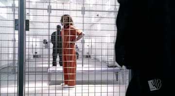
We cut to
a wider shot of Lionel. This time he's behind the bars, and
this shot is really nice. For one thing, the right side of the
frame is so bright, a lot of it is almost completely blown-out.
But then there's Lex, silhouetted and taking up the whole height
of the side of the frame. Then, the framing makes Lionel look
small in it, which emphasizes his whole captivity and takes
him out of a position of power. Then the guard behind him is
entirely black in silhouette, too, and so Lionel is essentially
trapped between two dark figures. It's a truly stunning shot,
and although Lionel is small, he stands out because he is the
only thing that has color in the frame, and a deep, intense
colour at that.
Also, can
I just mention that John Glover amazes me in this scene? Simply
an awesome performance. I also really enjoyed Mark Snow's score
here as well.
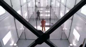
The ending
shot is so gorgeous. Here's where a screencap comes especially
in handy. The composition is completely perfect and amazing.
There are just so many things to see
in this shot. First, all of the bars of the cells add a lot
of lines to the shot. Lines are so
important in composition, as they create perspective and direct
your eyes. The walls are
bright white, and the floor is grey, so as the floor goes back,
the grey and the white
connecting together creates a line that makes our eye follow
them. These lines also create such depth to the room. The set
is fantastic, because it's so big and such an empty space, which
is emphasized even more because there's no real color to fill
it in. It's such a void place for Lionel to be. There is also
the guard, still in silhouette, and lights from above create
orbs of light on the grey floor. Then, Lionel stands amidst
the biggest, brightest light on the floor, still standing out
as the only colour, and finally, the huge black X provides the
most contrast in the shot, as well as framing Lionel perfectly
in its vertex. By far my most favourite shot of this episode,
and quite possibly the season.
When Clark
comes to the jail, and the camera pushes in really quickly on
Lionel. It's quite a noticeable and elaborate move. The camera
keeps moving back and forth, which is made more noticeable because
of the bars going back and forth in the foreground. As Clark
and Lionel debate, the camera and the bars look as if they're
going in opposite directions.
Finally,
the last 5 minutes are amazing. We cut to the jail, which is
very dark in comparison to earlier. Someone comes in and Lionel
says, "Do it." The man grabs his hair and yanks his
head back. The light is extremely high-key on Lionel's face.
Then we cut to Martha coming out of the house in slow motion.
She looks concerned and confused, but we don't know what she's
looking at yet. Nor do we know what they're going to do to Lionel
as we cut to an extreme close-up of his eyes. Quickly after
that, we cut to a government van bringing Chloe and Gabe. Then
we see a razor taken to Lionel's head, and Lex pours a drink.
Now here's where the magic begins.
Slowly,
as all of these scenes are intercut, we gradually learn more
and more what they're about. Naturally. However, the way in
which they're intercut is genius, because they all parallel
each other. When we cut to Lex pouring a drink, then there is
a cut of the electric razor. They're both essentially weapons
in both scenes.
Nerdy glasses
guy gives Chloe a once over from the van, which is kinda a 'Hey
how you doin' look, but considering the upcoming events, it
seems to signal something more. The camera turns around Lionel,
then cuts and continues much the same motion around Lexas he
takes a sip. Now half of Lionel's hair is gone, and this shot
just looks gritty. The stubble remaining on his head, the way
it's lit. Sadly, because of the dramatic irony associated with
it in retrospective, Gabe turns around and gives Chloe a 'Hey,
not so bad eh?' look.
Lionel's
hair drops, and then cut to the house exploding. I think it's
quite symbolic that the first time we see Lionel's hair actually
fall, that's when the house explodes. Similarly, the first time
we see that the Kent lawn is burning is after the fiery explosion.
Then, when we see Lionel's hair begin to fall the floor, there's
a match of motion to Lex falling. When we see Lionel's hair
hit the floor, then we see Lex hit the floor. Then the camera
pans past Lionel's and it's such an incredible shot. The editing
in this is so genius, because there were so many ways you could
have cut between the scenes (or not at all) but obviously there
were extremely careful choices made, and they all parallel and
work in with each other.
More intercutting
of Lex writhing and choking, burning symbols, and then Lionel
gets the last of his hair shaved and he says, "Thank you."
And the delivery on that line is perfect, and so very creepy,
and Lionel smirks. Ahh the symbolism of Lionel losing his hair.
I don't even have to discuss it, it's so obvious.
Cut to close-up
of Clark, with Jor-El's voice telling him he'll be reborn, which
is fitting because he's naked and in the fetal position in his
floating Superman shape. Interestingly enough, Clark floating
in his Superman symbol shape wasn't intercut. Which I think
is a good choice, because it leaves us in suspense as to what
happened to Clark, and doesn't interrupt the flow of the pull
back, which also happens really too quickly to cut between it,
just leaving us to absorb and feel for Clark.
Really nice
imagery in this episode, and I hope the premiere will bring
us even more!
Note:
The views of Kimberly don't necessarily represent the thoughts
and feelings of everyone at KryptonSite.
Return
home
|


